Connecting Connections Through Meetups on LinkedIn
A quick runthrough of our proposed LinkedIn meetups feature.
Coming into my fourth and final year in college, I found myself spending a surprising amount of my time browsing and networking on LinkedIn as the pressure mounted for me to find post-graduate opportunities in the working world. As part of a class on data-driven user experience design, I was able to team up with Amaya Mali and Michelle Wan who were both in similar stages of their college careers and we decided to see if we could figure out a way to improve the platform’s networking experience using our own experiences as well as the experiences of other LinkedIn users like us: particularly those interested in seeking career opportunities in the tech industry. In the end, my team’s conclusion was to design a new plugin for LinkedIn’s messaging feature which would help facilitate meetups between users and their connections. As part of this project, one of my primary contributions was facilitating our team’s design discussions and user interviews. Taking the decisions and discoveries from these sessions, I was able to plan, execute, iterate, and justify several elements of our final design such as the creation process for meetup invitations as well as the process for editing them on the receiving end.
Necessary Needfinding
While the desire to improve LinkedIn as a platform came easy to my group and I, revealing opportunities or problems at hand proved to be a more demanding task. We knew that we wanted to primarily target tech industry professionals for three reasons:
- The size of the industry and therefore the number of LinkedIn’s users we could have an impact on.
- The accessibility we had to that target demographic, thanks in part to our university’s large number of design, engineering, and computer science students (including ourselves).
- Our ability to empathize with this demographic due to being members of the tech professional community as well as our ability to draw from personal experiences in dealing with seeking jobs and networking in the industry through LinkedIn.
Based on these factors, we determined that the major issue wanted to tackle was the fact that while many of the top colleges provide their students with numerous opportunities for growth and development, especially for students interested in working in the technology sector, many people (possibly due to lack of accessibility to colleges, a late change in career path, or otherwise) are unable to take advantage of these opportunities and are left on their own in finding opportunities for growth both in their skills as well as their network. For many of these same people, it can be difficult to compete for jobs without proper and more in-person learning opportunities. We felt that LinkedIn, being an open and free platform made for networking, would be best suited for addressing this issue through the achievement of the following user goals:
- Allowing users to make relevant connections meaningful to their career development
- Encouraging engagement between connections which lead to recruitment, mentorship, or learning opportunities
- Facilitating small-scale meetings/gatherings between connections
- Allowing users to make and meet their own professional development goals
With the issue and goals in mind, we went about conducting user research in order to inspire some potential solutions or improvements which could be made to the platform. For our user research we primarily engaged with users in person, conducting interviews and directly observing several tech professionals with the goal of understanding how they went about furthering their own professional development and how they worked with LinkedIn to do so.
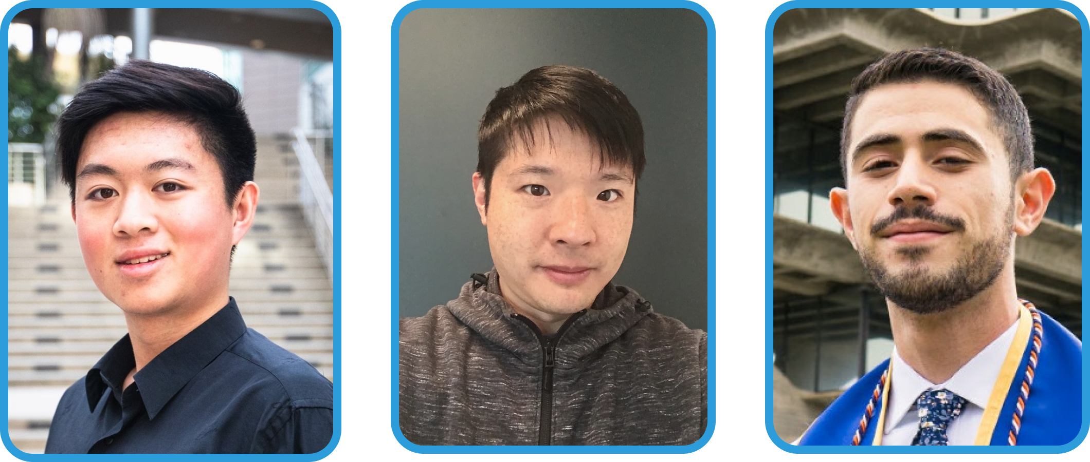
For our initial research our participants included (from left to right): a student seeking internship opportunities, a former tech hiring manager, and a UCSD career peer educator.
From our sessions, we discovered two key pain points related to our primary issue and user goals which were the fact that:
- Users were uncomfortable and intimidated in initiating connections with strangers.
- Users lacked an organized and easily discoverable way of finding development opportunities.
Combining our user goals and the pain points we discovered, we framed our issue into an addressable problem statement:
“People in the technology industry need an easier way to connect and communicate with recruiters and field experts to organize small-scale meetings/gatherings in order to build up their professional profile to expand their career opportunities.”
With this problem statement in mind along with a better understanding of our target users, we began to develop personas and look for further inspiration as to how we could address their issues.
Modeling the Target User
In order to better organize our research data as well as to ground our solution to a more tangible audience, we developed several personas of users we hoped to make an impact on. These personas held various real-life frustrations taken from our user research participants such as being unable to find relevant opportunities due to an insufficient network or being unable to connect with recruiters or potential mentor figures. By also providing these personas with motivations and stories based off of our user goals as well as our research data, we were able to broaden the experiences of the individuals we interviewed to a larger yet still tangible target audience for which our solution could be made for.
We generated personas with the following motivations based on our initial research: an entreprenuer trying to get advice and find employees, a soon-to-be graduate looking for jobs, and a disgruntled employee seeking greener pastures.
Finding Some Role Models
While we felt that our problem statement would be best dealt with through the LinkedIn platform, we knew of several others which tackled many issues like the one addressed in our problem statement through various means. Hoping to glean some ideas for our solutions, we looked at several of LinkedIn’s competitors ranging from other social media to online job boards.
For a social networking competitor, we primarily looked at Facebook and its groups feature. Something we really liked about Facebook’s app was its emphasis and promotion towards the groups feature, which allowed for its users to easily discover relevant groups to join and network with. An added benefit to the groups feature was that groups benefited many development and networking events by giving their planners targeted platforms to advertise their events and their attendees a place to engage with one another both before and after. LinkedIn itself has a groups feature, but most of the users we talked to in our user research were either unaware of its existence or opted to ignore it as they primarily used the app for finding opportunities rather than people. This prompted us to look then look into platforms more dedicated to this aspect of professional growth.

Facebook's groups and events features were a large inspiration for some of our earlier prototypes which translated aspects of groups onto LinkedIn.
To get a better understanding of how we could get through to users using LinkedIn primarily as a career platform rather than a social one, we took a look at several competitors in that space such as Handshake, Glassdoor, and Indeed. From these platforms, some interesting implementation choices we found included the use of anonymity for providing career-related advice along with the use of relevant and interesting tags as a way to recommend potential opportunities and events. Many of these features would play a large role not only in the development of our early solution’s user flow but would also continue to inform us through future iterations, helping us address feedback and critique later down the line.

Networking and event apps like Indeed, Glassdoor, and Eventbrite also played a role in some of our earlier idea formation due to their professional nature.
The Makings of a Model
With a tangible target audience and some inspiration from a few relevant apps, we went about laying the foundations for our solution through the development of two user flows which visualized distinct approaches to dealing with our problem statement.
Taking inspiration primarily from Facebook, Glassdoor, and even Eventbrite our first flow involved a revamped groups feature for LinkedIn with options for finding events and following event planners, discovering relevant potential connections within the group, and making anonymous posts seeking career advice or asking sensitive questions.

One of our initial prototypes involving groups on LinkedIn, on whiteboard.
Seeking to differentiate our approaches, our second flow was for a more intimate solution, allowing for users to schedule one-on-one meetups with potential recruiters and industry veterans. While much less directly inspired here, we modeled this flow off of some of the private messaging features of Facebook, Handshake, and even Indeed.

Another one of our initial prototypes in which LinkedIn users could schedule meetups, also on whiteboard.
With potential solutions in mind, it was time for my group and I to put them into practice. Having already outlined our ideas on whiteboard while coming up with our UX flow, we translated our designs into a more interactive and portable paper form for testing and went out to gather feedback on our ideas.

The finalized user flows for our prototypes prior to putting them onto paper for the first round of testing.
The Game Plan
A quick peak at what our first round of user testing looked like.
With paper prototypes in hand, we went about creating a plan for how we wanted users to go through them and the kinds of things we wanted to be on the lookout for.
As our groups redesign flow was a broader redesign, we had users focus on three primary tasks: filtering for potential connections within a group, finding a relevant event and following its planner, and posting/managing an anonymous post. As part of our testing, some things we wanted to see were whether these group features would be relevant and meaningful for our target users as well as if the features would be overwhelming to novice users.
In contrast, our messaging feature flow had a more focused purpose. As such, for this flow, we assigned users with the singular task of creating a meetup with a relevant connection and responding to it as said connection. For this version, what we were primarily looking out for was whether or not the information we had users input would be relevant for a meetup and if the process was intuitive and fit our users’ mental model for planning a meetup.
First Feedback
In order to test, my team and I set up our prototypes at a table within our university’s on-campus Starbucks and asked some of the patrons to take a look at them. Fortunately for us, relevant target users (people related to the tech industry) were not hard to come by and we received several pieces of interesting feedback.
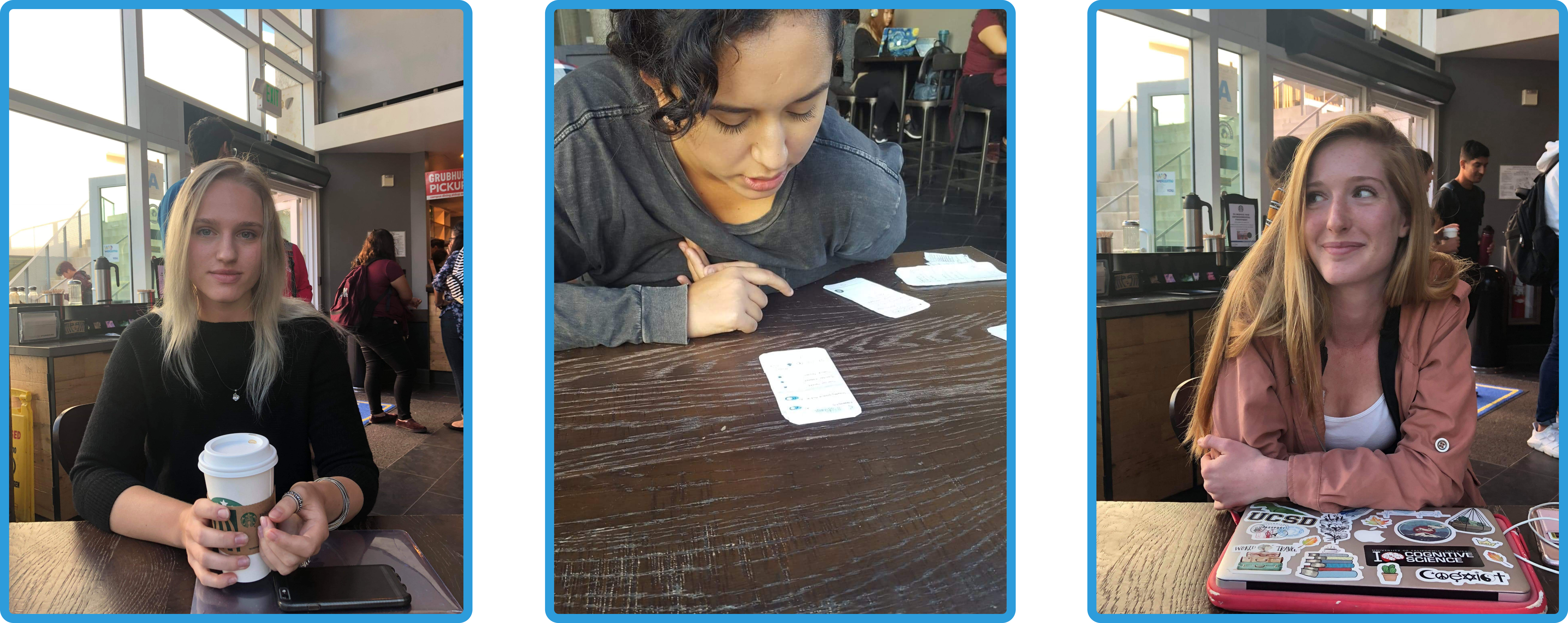
For our user testing, our participants included (from left to right): a social media group moderator, a web developer, and a research intern from a bioinformatics technology company.
For our groups redesign prototype, we learned from our user testing that many users were initially overwhelmed by the number of features we added as part of our redesign. Something we found interesting was that while most users had a brief initial struggle, many of them were able to use their knowledge of Facebook’s groups feature in order to reorient themselves. Users of LinkedIn who were already familiar with the app’s groups feature, a demographic which we weren’t able to capture in our prior interviews and observations, seemed to struggle more and were more vocal about being disoriented initially in our post-interview. Overall once users were oriented, however, they seemed to take an interest in the features offered by the new groups page and wanted some of them to be fleshed out further.

A messaging suggestions feature which made it to our final design. This feature was taken from the initial groups prototype.
During our testing sessions, we learned several interesting things about our meetups prototype as well. Being a single purpose plugin type solution, our testers felt much less overwhelmed going in, but as a consequence however, they struggled to discover the feature quickly. Users also felt that options for responders were rather limited and were sometimes confused by some of the semantic choices we made when labeling options and buttons. Compared to the previous prototype, however, our users generally felt that this approach was more proactive and was a much more interesting approach to networking.

Building off of feedback, our final iteration of the meetups design used LinkedIn's messaging suggestions as a way of making our feature more discoverable.
Combining our field findings with similar feedback we received from classmates and our TA. We felt that our goal moving forward was to develop a solution that encouraged LinkedIn users to engage in conversations with new people and facilitated opportunities outside of the app to develop those conversations into meaningful relationships. We believed that this approach would lead to more between-connection engagement and create more tangible opportunities for users on the platform in real life. As such, we decided to move forward with our meetups idea as the main basis for our higher-fidelity solution, incorporating some of the features from our groups redesign particularly those which encouraged users to make connections with new people.High-Fi(ve)
A comparison of some of our screens as paper prototypes to their higher-fidelity Figma versions.
For our higher fidelity solution prototype, we took the idea of being able to set up a direct invitation through messaging from our second user flow/paper prototype and expanded on it, we focused on making the overall experience more intuitive from our base paper prototype while also adding elements to help users get started with engaging with their connections. We did this by transferring a feature from our redesign prototype that allowed users to find and filter relevant connections within a group into a suggestions page that would help users find the people they would want to talk to and hopefully as a result eventually meet. We also worked on improving the overall visibility of the feature by providing users with more opportunities to discover it through LinkedIn’s messaging suggestions.
Within our high-fidelity prototype, we also took the opportunity to generate alternative flows/screens that we hoped to test in order to see whether they would improve the overall experience of our feature. Our first alternative was a replacement to the meetup creation screen, which was originally just a single-page form with dropdowns. In this alternative, we opted to walk users through each aspect of the form step-by-step with more visual cues and app-provided recommendations to aid them throughout the process. We wanted to see if having these extra aids would benefit new users while still being unintrusive enough to avoid frustrating more experienced users.
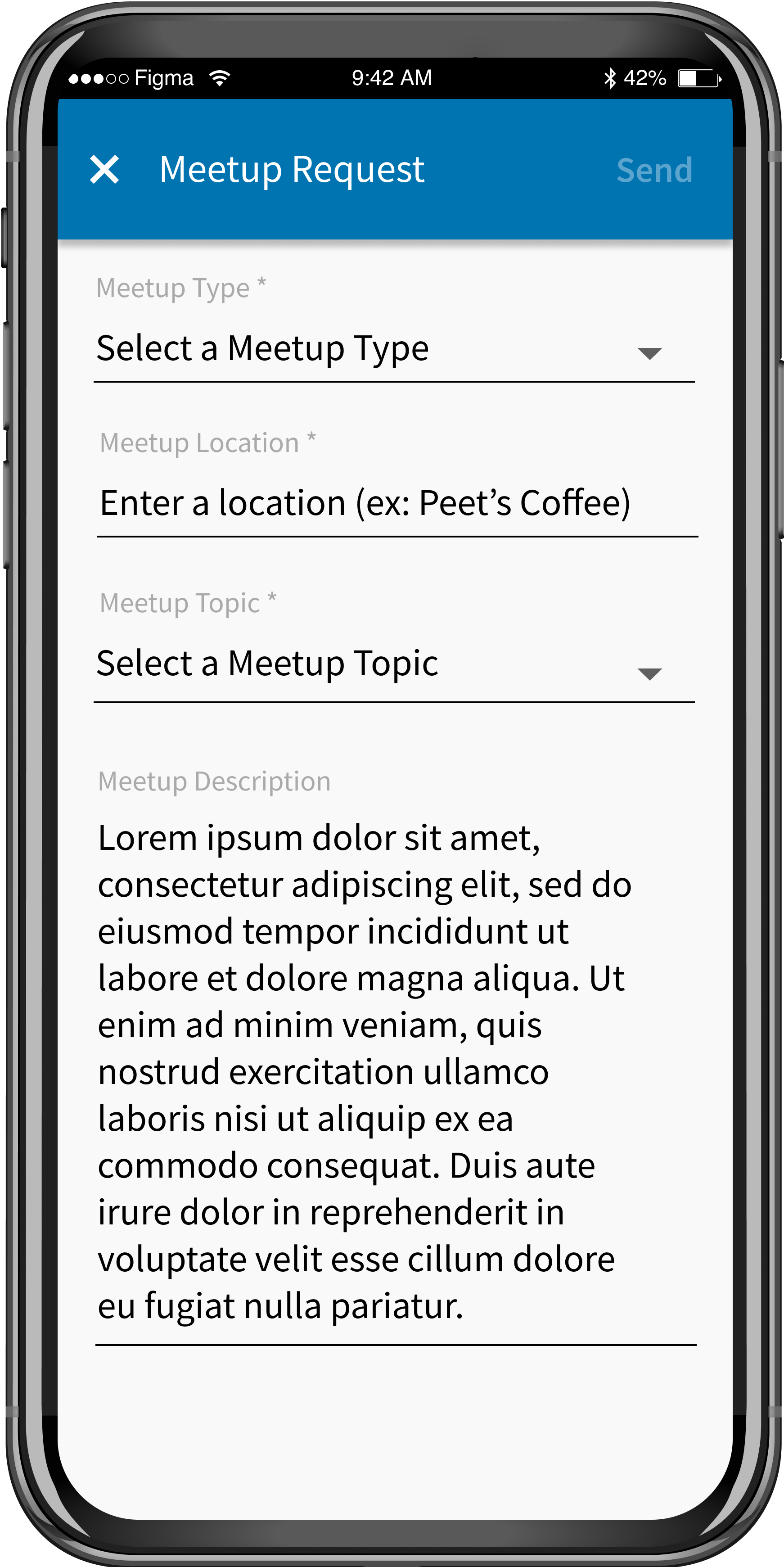
Our first alternative flow: A simple dropdown form vs. A more step-by-step meetups creation approach.
For our second alternative, we created a flow which allowed for responding users to edit sent meetup requests rather than just being limited to the options of accepting or declining. Our goal for testing this change against the original binary option was to see whether it would lead to increased engagement between users on both ends of the meetup request or if it would simply be an extra step recipients would have to go through.

Our second alternative flow: Providing users with the option to edit invitations rather than just canceling or scheduling a time.
Feedback Two: Electric Boogaloo
After completing the high-fidelity prototypes, we went back into the field to get some feedback from our users. Overall, based on the responses we received, the alternative screens/flows were seen as a marked improvement, with users finding the more aided process being more engaging overall and liking the ability to be able to negotiate meetup details on both ends. Our main critiques were mainly requests for some missing options and suggestions for aesthetic improvement.
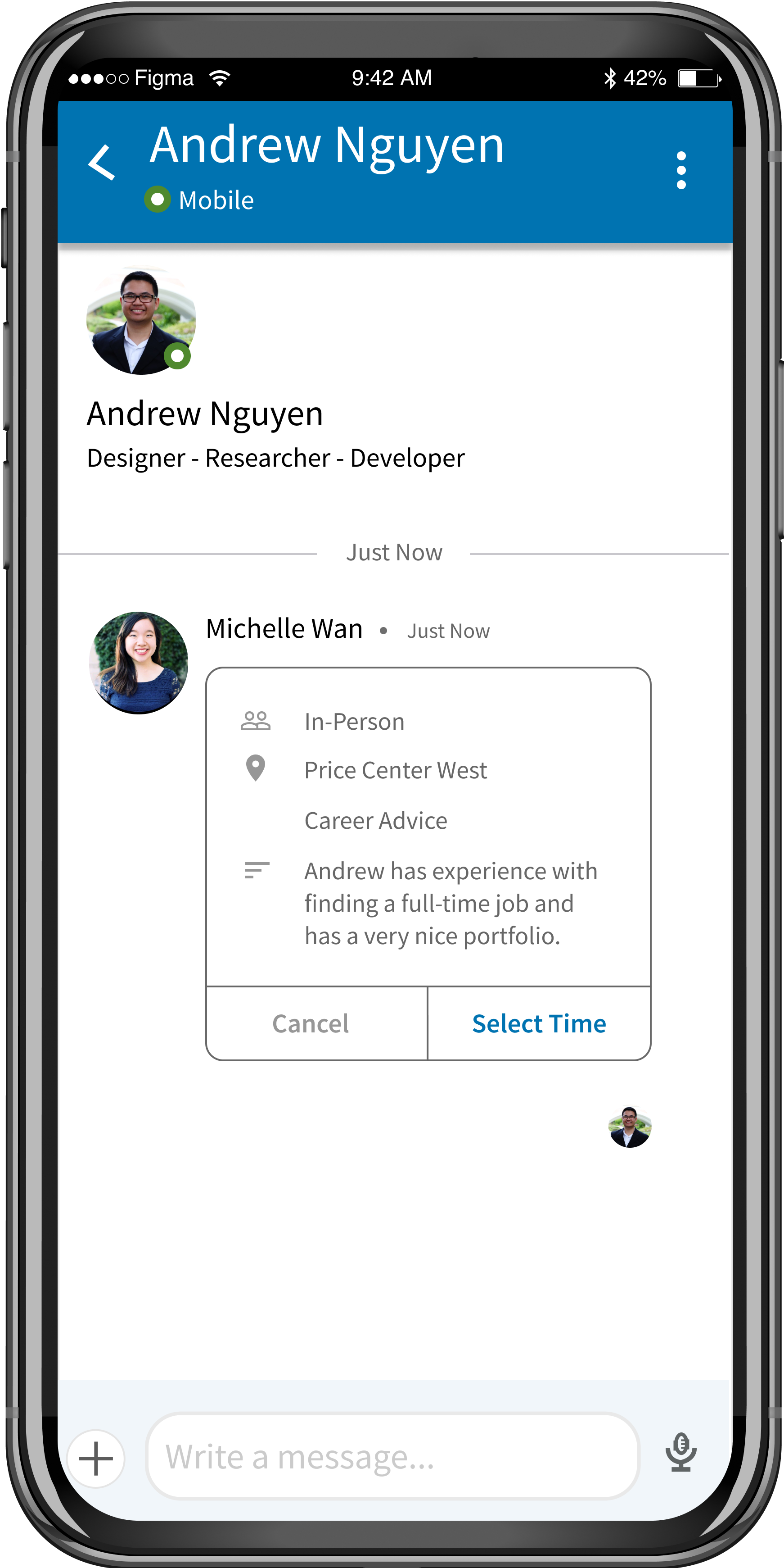

An example of some aesthetic improvements we made following our second round of feedback.
Wrapping Things Up
Based on the feedback we received in our second round of testing, for our final version we focused primarily on cleaning up the prototype’s overall aesthetics (adjusting spacing, aligning components more closely with Google’s Material guidelines, etc.). On top of this, we added a few screens and views to our prototype which our users felt were missing from the overall flow such as the ability to view the meetup inviter’s calendar to schedule a time and more clearly separated the ignore/decline meetup options which was something that was brought up in both of our user testing waves.

In making our higher-fidelity prototype we had overlooked including a feature for cancelling/ignoring an invitation. Based on prior feedback, we added it back to our prototype with improved options and functionality.
Challenges and Potential Extension
One of the critical factors which would contribute to the success of this feature is whether or not LinkedIn users choose to engage with their connections in a way such that meetups become an option. If LinkedIn users opt to not communicate through the app's messaging system or are afraid to reach out to their connections, our meetups feature would most likely be undiscoverable and, eventually, forgotten. After wrapping up the redesign project, I went on and tried coming up with a way to encourage LinkedIn users to engage in messaging conversations with their connections. One of my solutions was to improve on LinkedIn's current message recommendation system and make it more customizable on the user's end. By providing users with a more flexible message recommendation system, users may be less afraid to start conversations and, as a result, more likely to get to the point in which they would be able to use our feature.
An add-on feature to our final design which would help users create messaging templates to ease communication with their connections.
In Conclusion
Overall I learned a number of things over the course of this project, not just about the design process but also about the LinkedIn app itself and the design decisions made on it and various other similar apps. Something that this project really made me do was how to dig into products and applications more deeply. Despite having used LinkedIn for nearly two years, only while doing this project have I so closely looked at all the app has to offer both in its features and its design. I feel that this new way of looking at apps has contributed to my overall abilities as a designer. I also genuinely believe that my group and I did a good job at creating a feature that not only has the potential to give LinkedIn users a new and impactful option that they’ve never had before, but also one that looks and feels like it belongs on the platform. Like any designed feature, however, there is still plenty of room for testing, iteration, and improvement left. Without testing on multiple users at once for example, there’s no real way of being able to tell if this feature would truly work in practice and actually increase connection engagement. Should I be able to see that this feature is effective, I’d also love to be able to test this design with a larger target demographic to see if it would be helpful to people in non-tech industries.
Back to Top
<< Back to Main Site


